SAALT
Teen Rebrand
Today’s teens are making the switch to comfortable, sustainable period care that fits their active lifestyles—whether at school, during sports, or while they sleep.
I led the art direction and design for the Saalt Teen Period Underwear launch campaign in 2024, bringing a refreshed visual identity to life through campaign photography, packaging design, and digital marketing. The work spanned photo art direction, creative system updates, and the design of ads and emails to ensure a cohesive, Gen Z-focused launch.
SERVICES
brand identity, creative ideation, on-set art direction, shotlist, stylist, email design, product launch campaign strategy, web assets
Art Direction / Graphic Design
Creative Direction by Carmel Samiri, Photography by Marc Gabor & SO Manifest, Soona Studios, Lighting by Alex De La Hidalga, Production by Liz Raphael, Makeup/Hair by Michaela Lew, Copy by Rachel Axtman, Videography by Jacob Perry, Video Ad by Claire Corbin
CREDIT


Art Direction - Photoshoot Campaigns
I led the creative art direction for the Saalt Teen Period Underwear campaigns, highlighting the product’s use for daily sport activities—delivering a message that periods shouldn’t stop teens from living their lives to the fullest.
Brand Refresh


To align with the Teen Sport Short launch and a fast-evolving Gen Z audience, Saalt Teen underwent a brand refresh featuring a bold, high-energy palette and visuals that distinguishes it from the core Saalt brand while celebrating teen individuality.


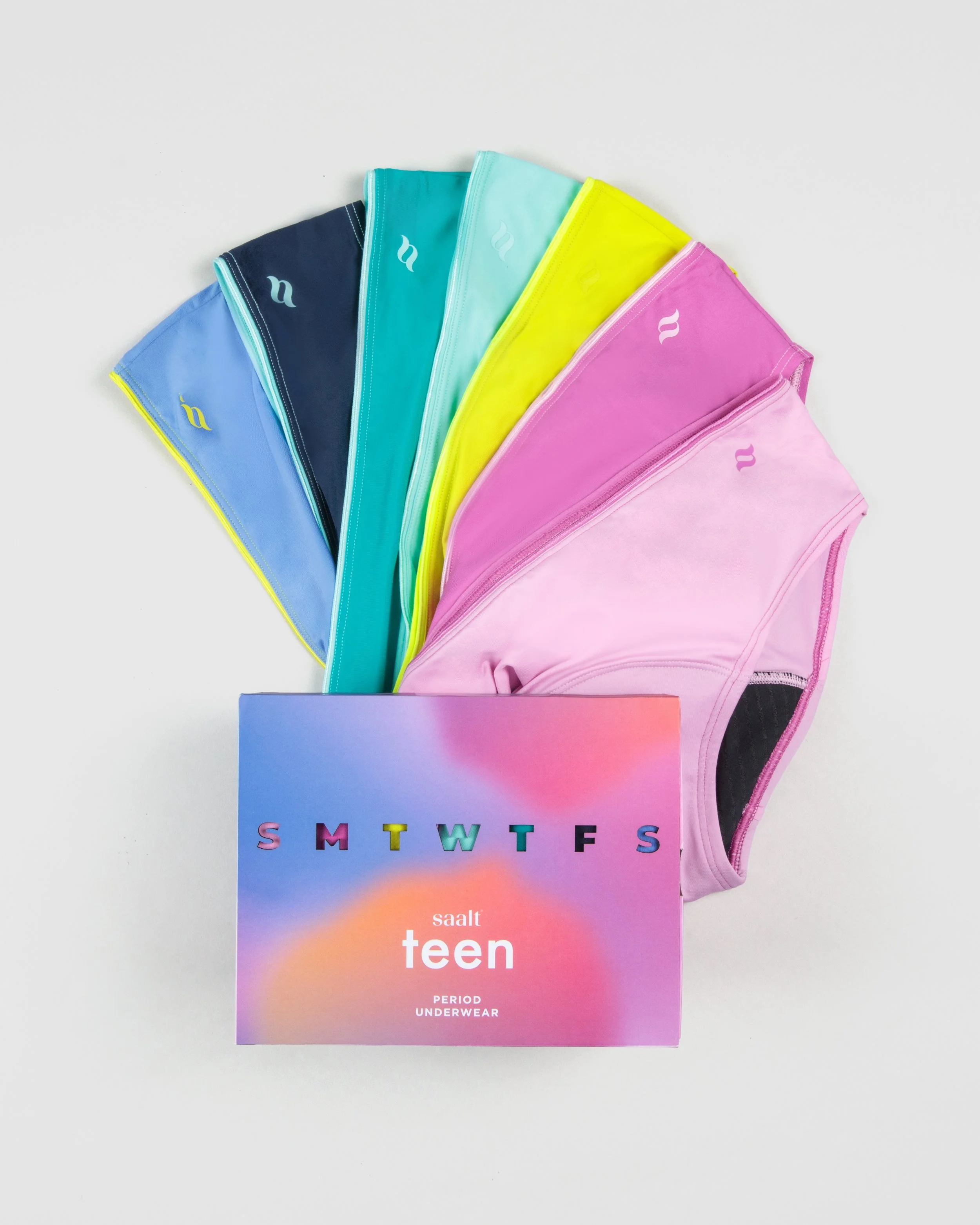
Print & Packaging
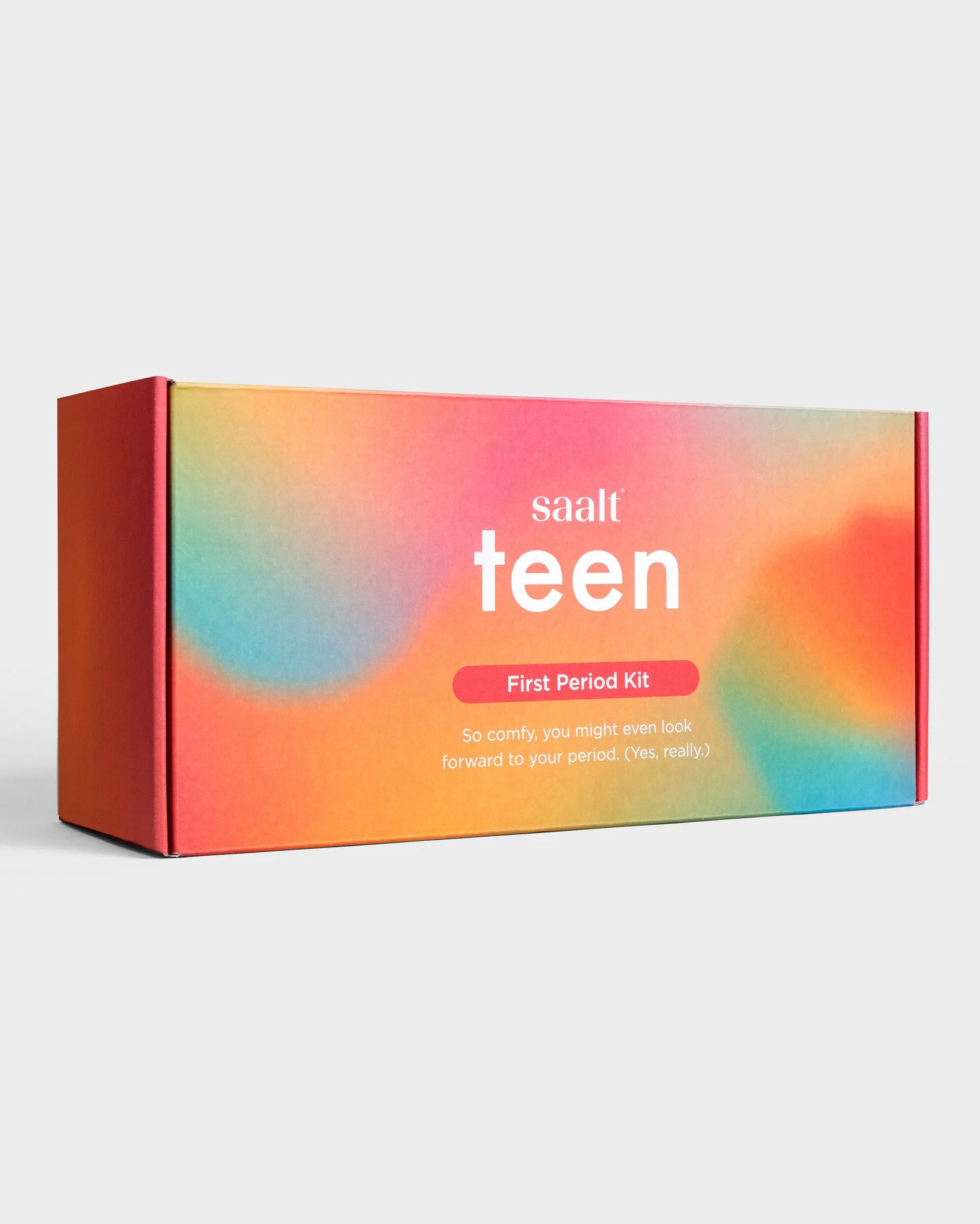
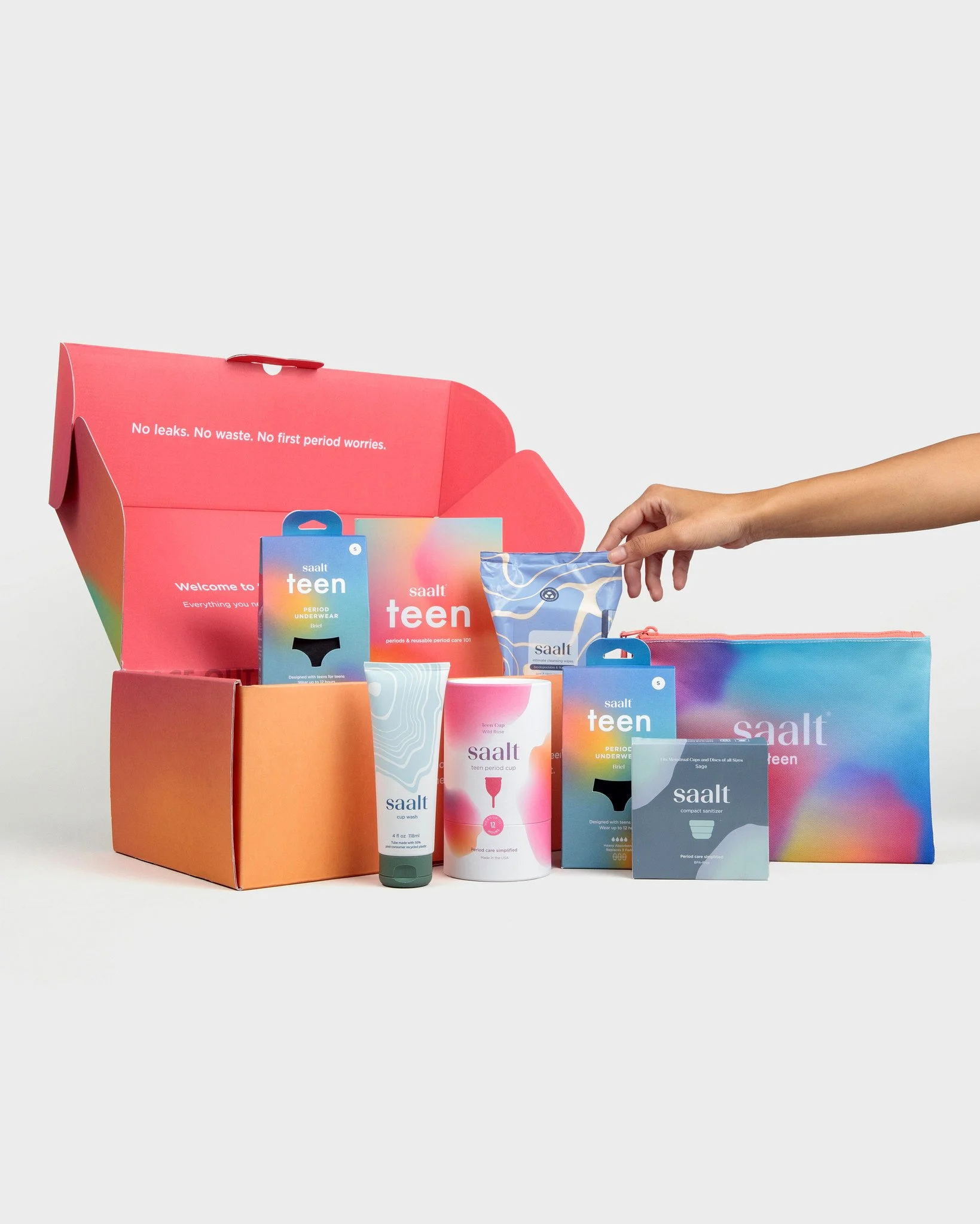
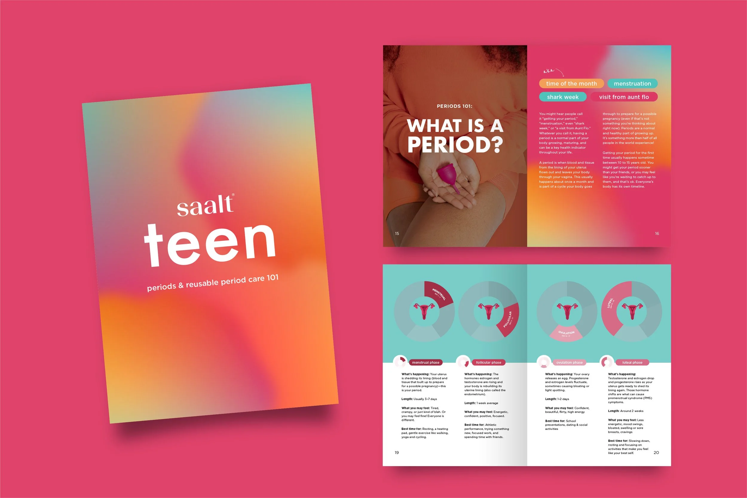
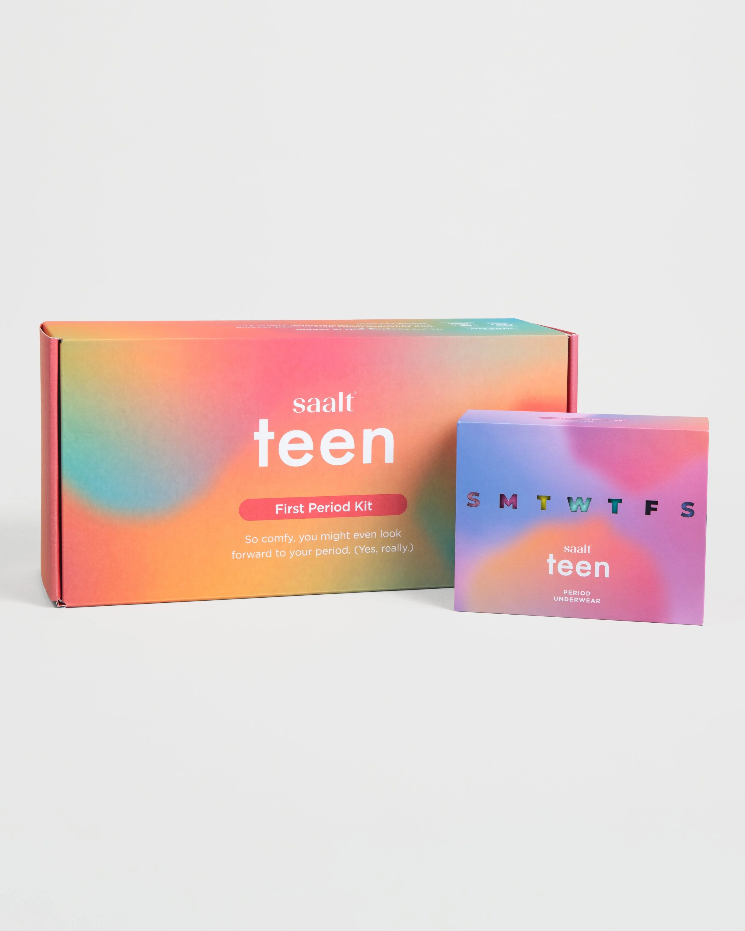
I owned the graphic design support for the following packaging products: Saalt Teen First Period Kit (+ Period Care 101 booklet) & Teen Days of the Week 7-Pack—ensuring the creative aligned with teen brand identity and business objectives.
Email Campaigns
To build anticipation for the Teen Sport Short launch, we released three emails: a teaser to spark curiosity and introduce the new teen branding style, a launch email to highlight the new product launch, and a follow-up “ICYMI” reminder.
Each email was crafted to align with the new teen brand visuals, while working in sync with social media to create a cohesive, cross-platform go-to-market experience that boosted site traffic and product visibility.

Ad Executions


We ran a series of ads in tandem with the Teen Sport Short launch, highlighting key components and bold copy, drawing attention from our audience.

MOOD BOARD
This mood board guides the Saalt Teen rebrand toward an expressive and effortlessly cool identity, with blends of Y2K, sporty, and digital-forward aesthetics, mirroring how Gen Z pulls from the past while setting their own trends.